Below are some pointers that should help you produce a clean, legible and professional presentation.
Software Selection
All presentations will be shown using Microsoft PowerPoint, version 7 for Windows. It is very important to either create your presentation in that version or convert your older version Windows or Macintosh presentations prior to the Conference. Many problems can arise during this conversion. Most, if not all can be fixed but they take time.
Page Setup
Your presentation should be sized for an on-screen show, not letter or 35mm slides. This can be easily changed under the "File/Page Setup menu". This should be done prior to creating your presentation graphics because if it is done after, your scanned pictures, graphics, and text margins will be stretched and distorted.
Font Size/Style
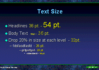
As a general rule type sizes below 14 point in size are difficult to
read on the projected computer image. Try to use 18-30 point type for body text and 30-44 point
type for titles. A simple test for readable text is to stand away from your computer monitor at least six feet. If you can read the text it is large enough for the big screen. The type size difference between the title, subtitle, and body copy should diminish by at least 20% in size so that the eye can distinguish the differences in size.
|
|
|
|
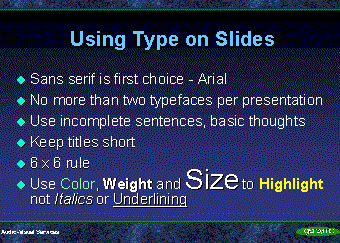
Text Slides - 6 x 6 rule
No more that 6 words per line and 6 lines per slide. This is also a good rule for tables as well.
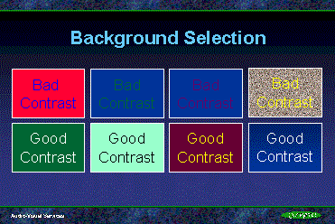
Background Selection
Contrast is the key to a good background. Dark Background, Light text or Light Background, dark
text. For the Conference presentation stick with a simple background such as dark green or blue.
Some shaded backgrounds show banding when projected through a data projector but a blue to black shade will look good if you desire a shaded background. See examples below.
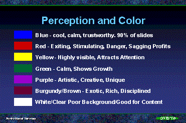
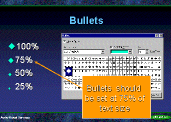
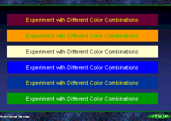
Color Selection
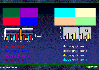
Limit the amount of colors to 3 or four different choices. Use color to highlight important points and to unify your talk. Do not use color just for color's sake. Avoid the use of highly saturated colors for use in text, graphics, and data charts. Instead use light pastel colors. See graphic.
 |
 |
Use of Scanned Images
When scanning photographs scan them at a usable size and resolution. Typically one would think that a higher resolution would be better. This is NOT true when scanning images for computerized presentations. The formula for scanning for this is to size your image for full screen 480 pixels x 640 pixel horizontal at 96 dpi. This size will fill the computer screen while maintaining a relatively small file size. If you need only a small picture scan it at 320x240 pixels. This will fill half of the screen. Making pictures smaller in PowerPoint does not make the file size smaller.
If you use very large, high resolution images you gain nothing. In fact you will bog your presentation down because the large scanned files will take a long time to load.